


An example of one of the two types of “Endcap animations" AdSerts offered for client use on their sales floors. This particular video is an example of the shorter “bumper” style promotional, which is designed to be a shorter and less information heavy motion graphic presentation, intended to be combined with a series of similar bumpers and promotions that would cycle on televisions within the stores. These bumper-style promotions were designed to be regularly modified as to showcase different promotions on a weekly or monthly basis, as such they needed to be designed and have the After Effects file structured/organized in such a manner as to make such changes could be implemented quickly and easy by lesser experienced assistant.
This animation was designed to contain a number of modular elements, which were constructed within the main source file to be easily turned on/off, and clearly marked with captioned callouts as to the process required and short “how to” instructions in the appropriate layer names on the After Effects timeline. Further identification of the layer’s intended modularity was indicated by the color coding of the layers, in accordance to their intended malleability.
MODULAR DESIGN
This animation was designed to contain a number of modular elements, which were constructed within the main source file to be easily turned on/off, and clearly marked with captioned callouts as to the process required and short “how to” instructions in the appropriate layer names on the After Effects timeline. Further identification of the layer’s intended modularity was indicated by the color coding of the layers, in accordance to their intended malleability.
The background "board" assets created for use in the endcap promo.

CUSTOMER AND CULTURAL RELEVANCE
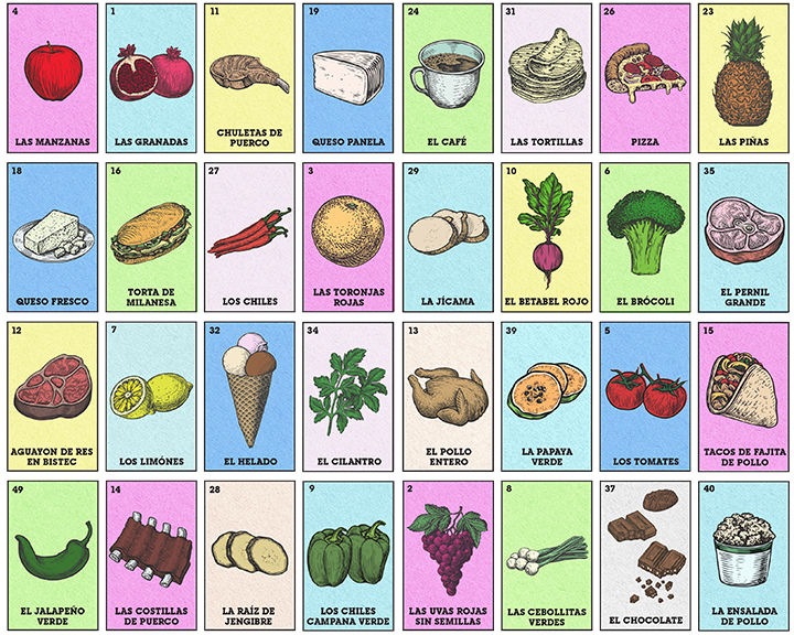
This bumper was designed for use by “El Rey”, a grocery store / restaurant chain with a very strong Latin identity and customer base. With care to soundboard with the Mexican/American co-workers, the desire was to come up with a series of bumper formats that colorfully yet respectfully featured elements of latino culture. The BINGO-adjacent game “La Loteria” was chosen as the first subject of what was initially intended to be a series of different themed bumper types. As for the different “spaces”, the food items chosen were taken from sale items featured in the (at the time of the bumper’s creation) last two months of paper ad promotions created for the company. The food images themselves were initially sourced from 3 different collections of vector clip art that more or less matched stylistically, with some minor modifications implemented to further match the style and color added to them all. Additional food items that could not be sourced from pre-existing assets were then constructed through a combination of photobashing and being drawn from scratch
Example images of the classic La Loteria game.
Image acquired from Wikipedia
CLIENT BRAND CONSIDERATIONS
El Rey primarily markets itself as a “family” chain with a Latin focus, often going so far as to hold events in their parking lots intended as entertainment for their customer base (small fair-like festivals, lucha libre wrestling matches, etc). It is because of this fact that La Loteria was chosen as the bumper’s design theme, as the game has become a cornerstone of Latin American family culture over the generations. Further, though less obsequious, branding considerations were implemented in the “backs” of the card deck, as the colors and even some of the symbols of the back pattern, have an association with the El Rey brand; including, of course, their logo.


El Rey's company logo.
Image acquired from: https://www.elreyfoods.com/


These animations represent the second kind of endcap animation offered by AdSerts: a longer, more “presentational” piece, with music elements added to further draw the attention of shoppers. Many of these animations, specifically the Bird of the Month and Yeti examples, were designed in a manner as to contain reoccurring stylistic elements that would be repeated in subsequent promotions for the brand, as to build a “style” as to help anchor a distinct feel in the minds of reoccurring shoppers for the specific brands.


© 2026 by Gene C Koch III. Powered and secured by Wix